PROJECTS
Project Foundry
Designed with love by the Foundry Team.
HOW FOUNDRY WAS MADE
The Challenge.
A call to make a platform that unifies efforts in the field of design and data under one roof. To execute a constantly evolving plan to link ideas, events, information and people .
Research
Phase 1
Information Architecture
Phase 2
Branding
Phase 3
Development & Testing
Phase 4
Phase 1
Research
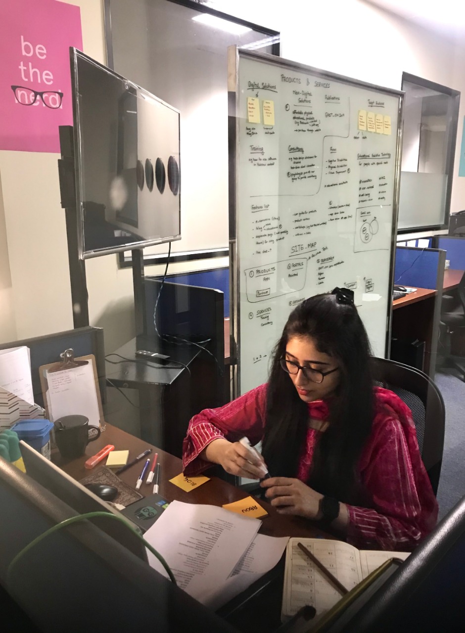
All great things begin with an idea but to materialize that idea, one needs to examine its feasibility and impact.
It was crucial to identify our target audience before moving ahead. A huge chunk of this phase included examining work already being done around the world and scrutinizing best practices. We conducted several meetings with the director and program manager to understand the goals of this initiative.
Phase 2
Information Architecture
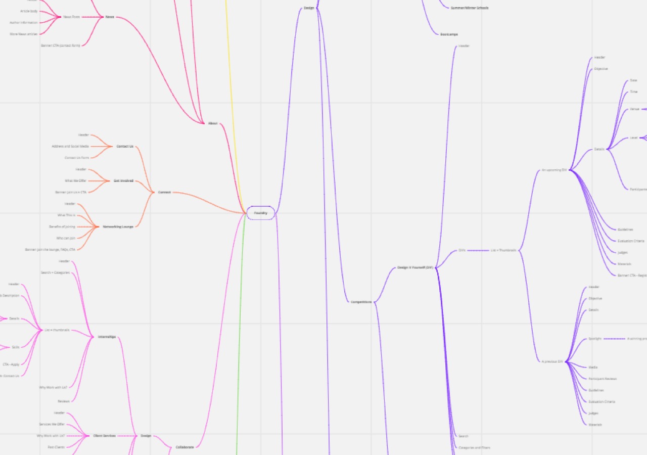
Our goal was to be simple yet impactful.
We understood we were aiming big and we started with no structure. We then pulled all-nighters to design a suitable site-map and information architecture.
When it came to copywriting, certain terminology and jargon were preferred over the other given our target audience. It was essential to repeatedly check the flow of information to ensure the reader followed through.
Phase 3
Branding
The creative problem
Foundry is a place for exploration of ideas, discovering your passion and experimenting with novel concepts.
We wanted to capture the fun aspect of Foundry while maintaining its professional outlook for the industry and academia.
Logo Design
Task 1
Color Palette
Task 2
Typography
Task 3
Art Style
Task 4
The creative process
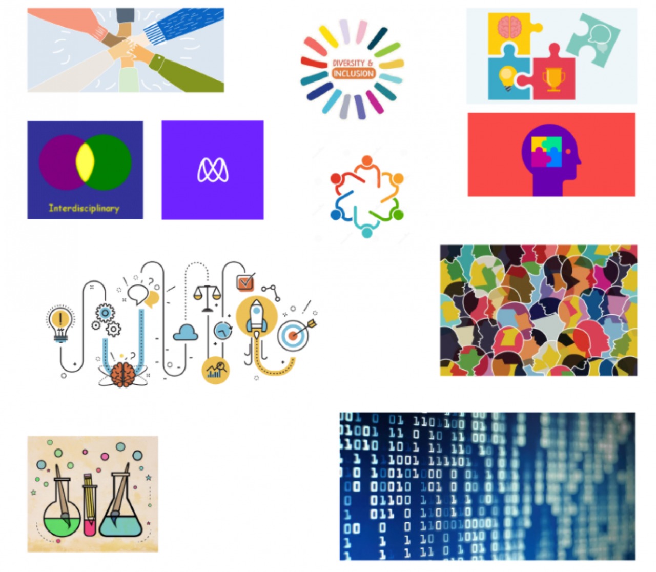
Our creative process started with delineating the core values at the heart of Foundry. This activity paved the way for the development of a mood board based on these keywords.
01. Interdisciplinary
02. Diversity
03. Experimenting
04. Design & Data
05. Modern
06. Creative
THE LOGO
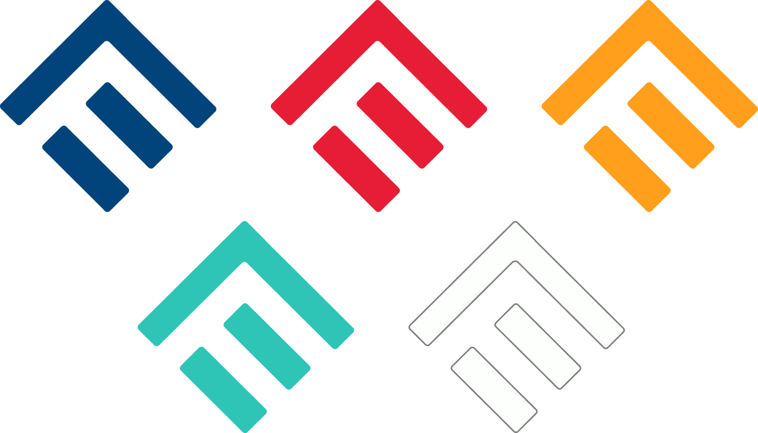
The final logo consists of the letter F (for Foundry) contained in a perfect square, utilizing negative space.
- The logo signifies growth and moving forward through an arrow pointing above.
- The arrow also acts as a shelter symbolizing the idea behind Foundry being a space for people with different disciplines to come together and experiment with design.
- An equality sign contained within the logo signifies that we treat people from all disciplines as equals.

THE COLOR PALETTE
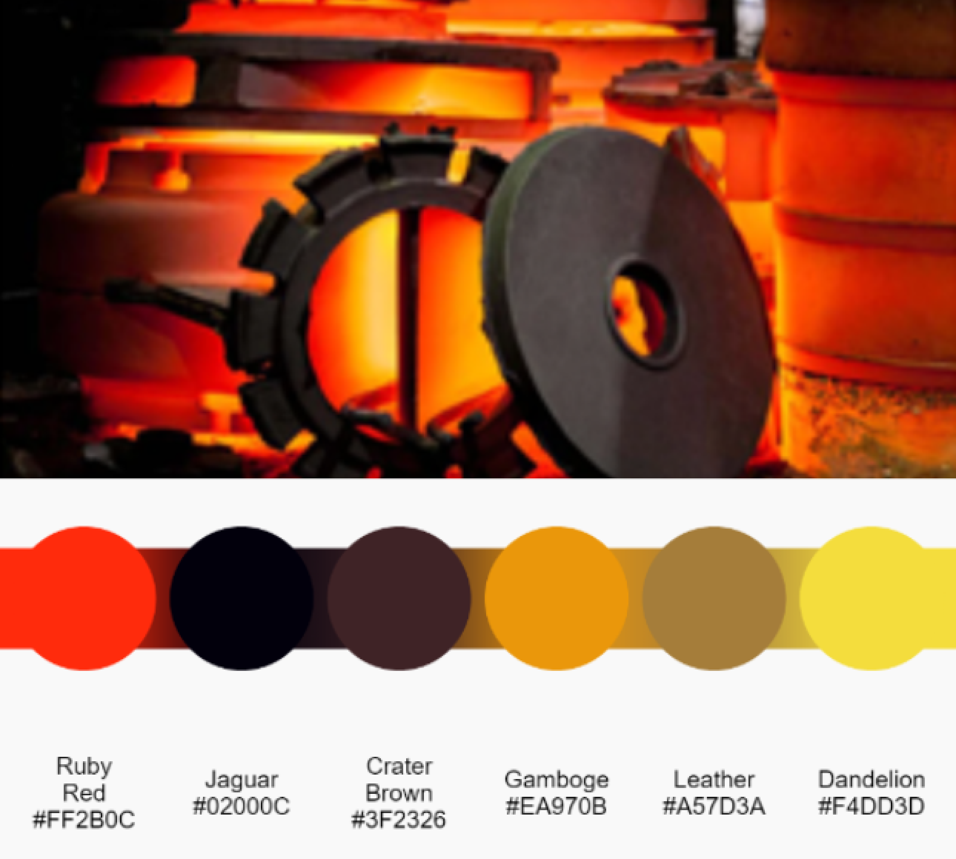
We started off by exploring the textbook definition of “Foundry” and took inspiration from how molten metal is casted and shaped, analogous to how we want to shape the narrative of design and data. Initially we went for a warm palette.
However, the playfulness and friendliness we wanted to go with was missing. Hence, we explored other attributes, including the aspect of Foundry being interdisciplinary.
Finally, to achieve the playful and welcoming feel for foundry, we chose a color palette that completely captures all its attributes.
01. Blue as a symbol for inspiration and wisdom.
02. Rose to give a more welcoming and calm feel.
03. Yellow to add happiness and playfulness.
04. Teal to evoke feelings of trustworthiness and reliability.
05. White to balance out the other bright colours.

Headline

This is our clean, minimal sans-serif paragraph text.

TYPOGRAPHY
For Headlines, we decided to stick with a bold, heavy typeface
and for paragraphs we went with a clean, geometric
typeface.
THE ART STYLE
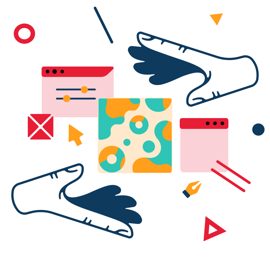
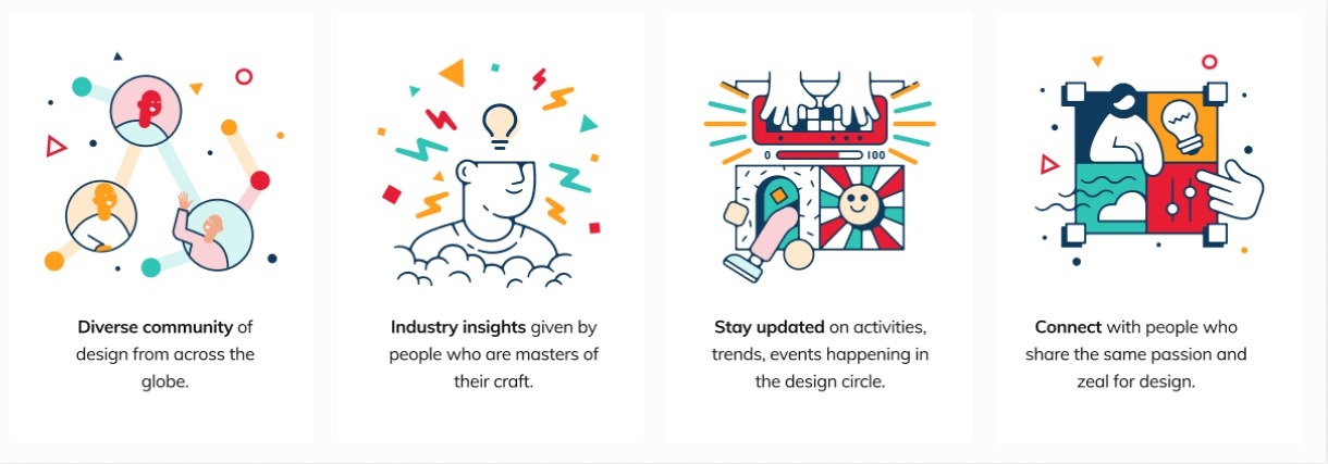
We decided to go with an abstract and playful approach using a mix of shapes and characters. For characters, we decided to omit sticking to one gender to maintain gender neutrality. Sticking with our art style - abstract, minimal, geometric shapes - we started off by playing with basic shapes to manipulate illustrations.

Phase 4
Development & Testing
The development team worked closely with the design team to translate our design into a fully functional website. Throughout the process, we remained very particular about margins, padding, alignment and responsiveness. Our hardwork paid off in the end.
The Output?
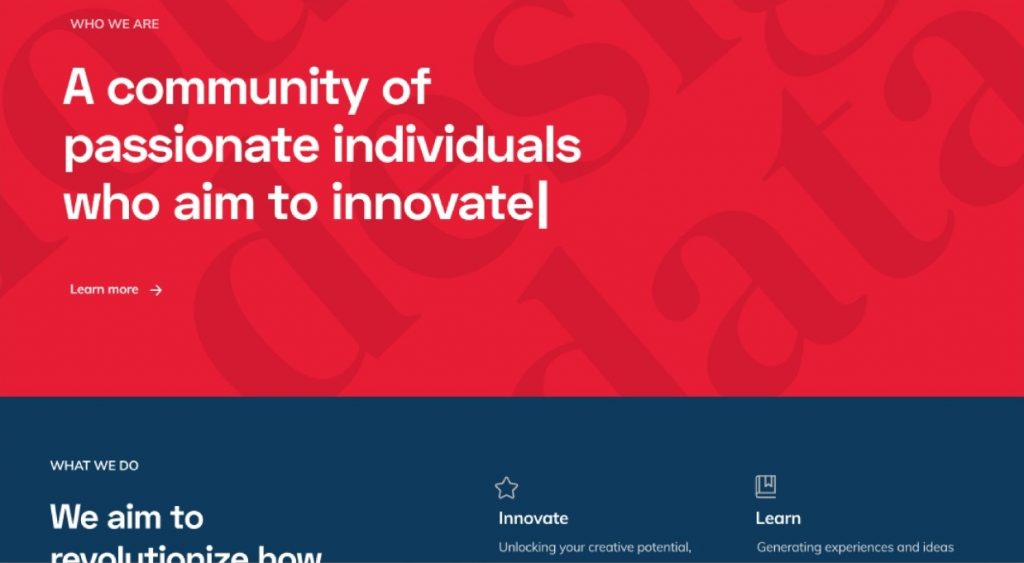
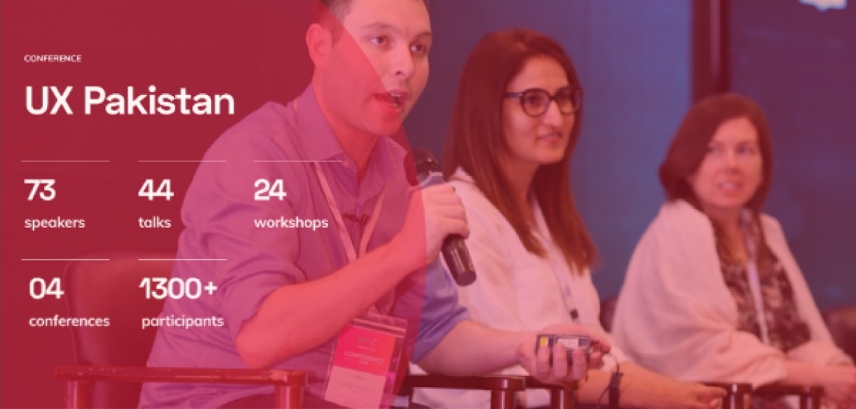
A simple yet comprehensive site that manages to provide a wide array of services and information. It does not only follow modern design language but also complements it with appropriate illustrations and images. Using a timeless color palette and layout ensures the site won’t go out of touch anytime soon.
Meet The Team
Foundry, as a project, would not have been possible without the diversity and experience our team members bring to the table. Our strength is in our interdisciplinary background which helped in shaping this platform. Meet the team of digital warriors, ready to harness the power of design and technology for good.


