Meri Kahani
By Mehreen Masood
The Problem.
Meri Kahani is a mobile application for teaching computational thinking to teenage girls living in the low socio-economic areas of Pakistan through gamified learning in a Pakistani context. My responsibility was to design this platform using the human-centered design approach.
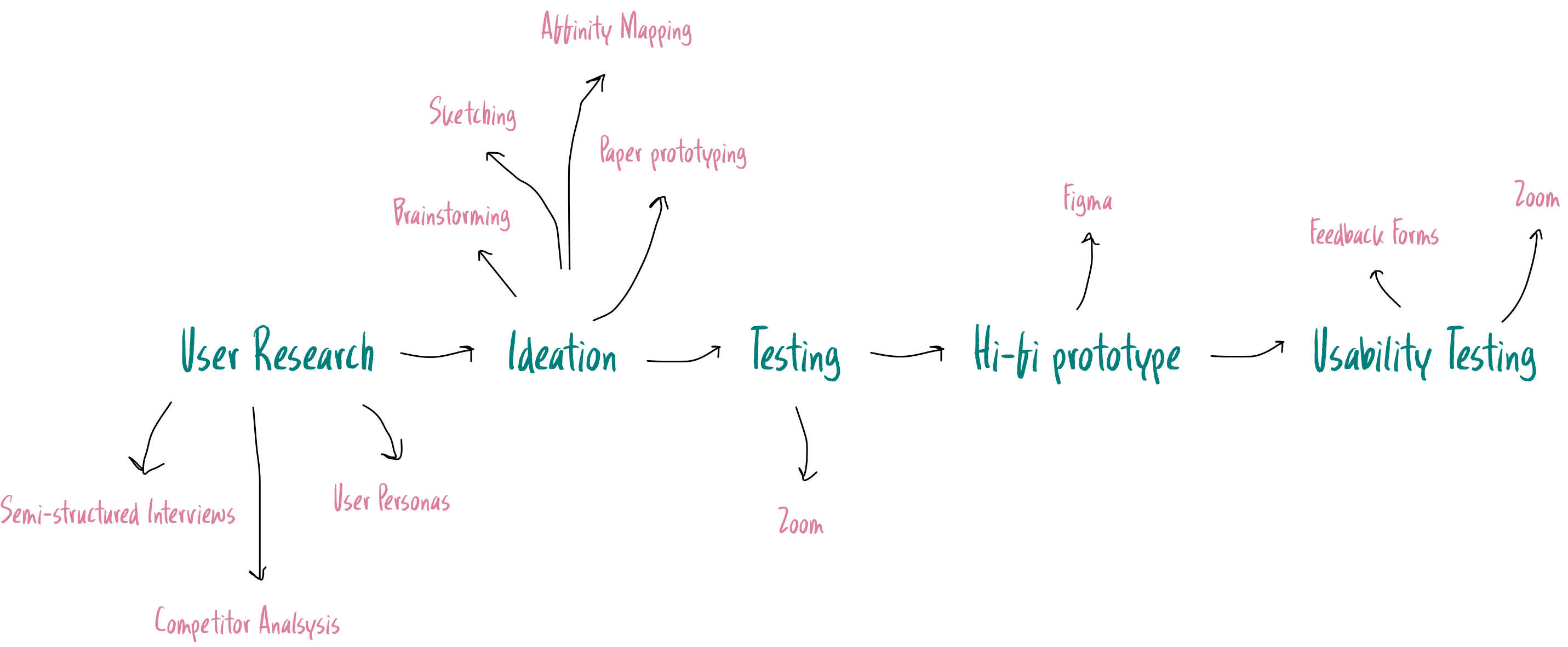
The Process
The Problem.
In recent years, various countries that have undertaken curriculum redesign for primary and secondary education have endorsed computational
thinking as an essential mindset for teenagers.
– Millions of Children are deprived of top-quality education in Pakistan
– Young females are amongst the worst affected
– Low opportunities for females to enhance their computational thinking skills:
- Implicit social biases
- Lower quality education
- Stereotypes
– Severe gender gap exists within the computer science field in Pakistan
PART 1
User Research
Target Audience:
– 22 school-going Pakistani girls belong to developing areas
– Aged 13 17 years
– We targetted two community schools in Lahore:
Allied School and Government District Girls High School
Method:
1. Semi-Structured Interviews
2. Contextual Inquiry
3. Competitor Analysis
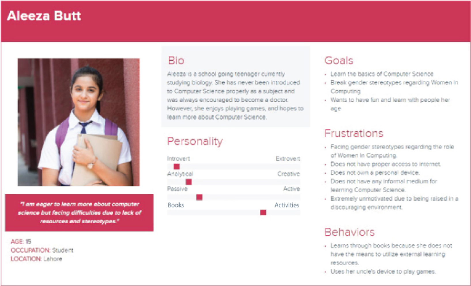
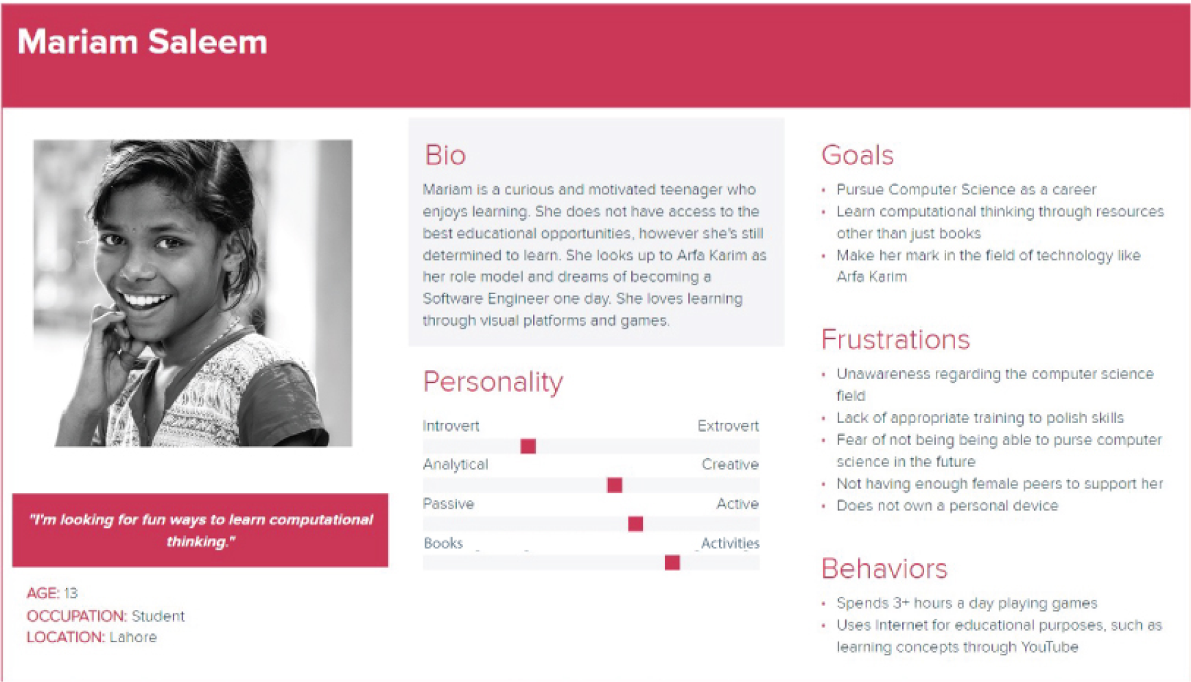
4. User Personas
Semi Structured Interviews & Contextual Inquiry
The semi-structured interviews were held in an isolated environment to minimize distraction and allow the participants to focus better. The interview questions aimed to gauge the participants current interaction with technology and their interest in gamified learning techniques.
Questions:
1. Do you like learning about computers/technology and have you studied about computers before?
2. Do you like learning through games and activities or books and lessons?
3. Do you have internet access at home? If yes, how do you use the internet for your education?
4. How often do you play games on your phone? What type of games?
5. What kind of devices do you have at home? Personal or shared?
To conduct the contextual inquiry and test the CT skills of the participants, we designed three unplugged problem-solving activities based on various CT concepts for the participants to attempt:
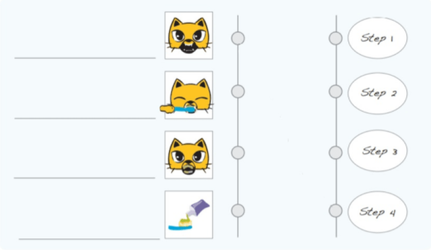
(i) Diagram Labelling Identifying the correct order of steps for brushing teeth
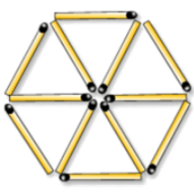
(ii) Arranging the Matchsticks Make the maximum number of triangles from twelve matchsticks
(iii) The Paper Plane problem Identify the correct order of steps to make a paper plane

Furthermore, we made the participants play Mazes and More, a labyrinth-solving mobile game, to observe their comfort level with mobile games.
Observations made during Contextual Inquiry:
1. Behavior
2. Facial expressions
3. Emotions
4. Number of help calls by the participants
5. Activity completion time
Competitor Analysis
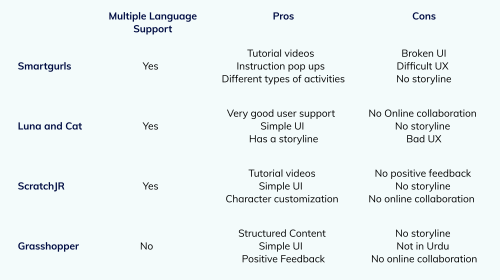
We performed competitor anaylsis on direct and indirect competitor apps used to teach Computational Thinking. The method used for analysis was Heuristic Evaluation.
User Personas
Findings
Gender Gap and Lack of Awareness:
Increasing gender gap in Computer Science within Pakistan.
45% of participants showed little to no interest in Computer Science.
A computer was nothing more than just a “device” for them.
Current Use of Technology:
All participants had internet connection at home but 73% did not own a personal device.
Participants were comfortable with Technology and 80% easily
navigated through Mazes and More.
Language Accessibility:
One unusual finding of our study was that most participants were comfortable with the English language.
73% preferred English language, 13.4% suggested using both English
and Urdu.
Poor Computational Thinking Skills:
Only 9.0% of the participants successfully solved task 1 and 2. Only 1 participant was able to solve task 3.
36.4% of the participants frequently asked for hints suggesting a weak understanding of CT concepts.
Digital Game Based Learning:
86.3% of the participants prefered learning through games.
The participants completed Mazes and More in approximately 17.6
seconds, significantly lower than the time taken to complete
unplugged activities.
Inspiration from Female Role Models:
Most women look up to female role models for inspiration and before making tough decisions.
One of the participants stated that “there is a lack of females within the field of computer science. However, the one person I look up to is Arfa Karim.”
PART 2
Ideation
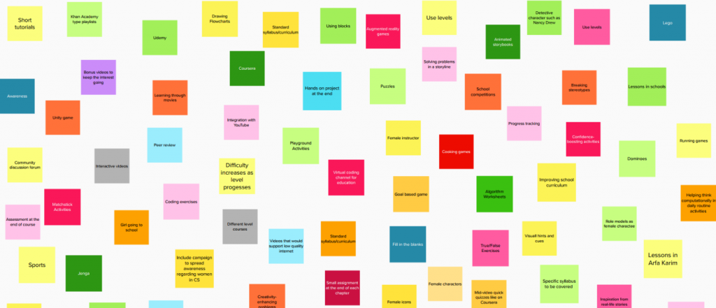
Brainstorming
1. Refresh Problem Statement
2. Individual Brainstorming Session
3. Group Discussion
4. Grouping ideas
5. Prioritisation of groups
Key Insights and Design Decisions
1. Feminine Theme
2. Teaching Computational Thinking within a local context
3. Shortlisting Computational Thinking Curriculum based on research
4. Gamified Learning
5. Providing Support through hints and language accessibility
6. Allowing users to customise the game through avatars
7. Motivating users through game rewards
Sketching
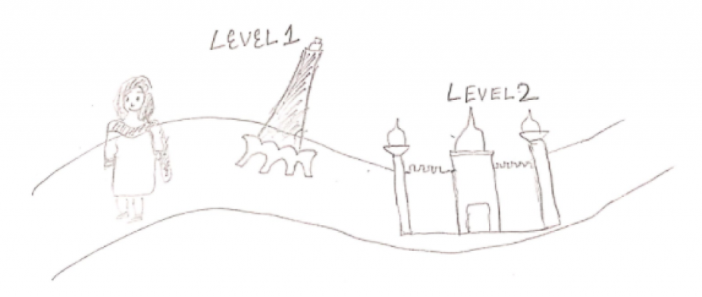
A sketch illustrating our main idea about the game map and character.
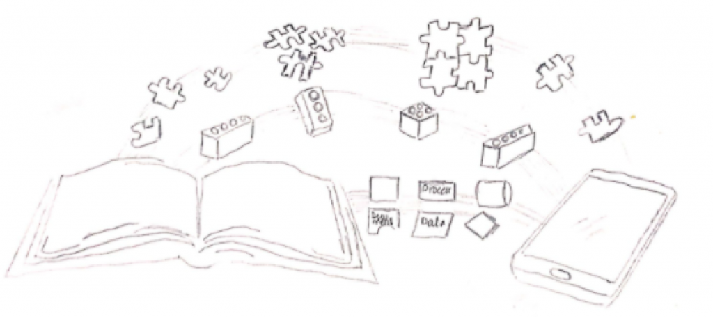
A sketch illustrating the use of technology for teaching book curriculum.
Scenarios
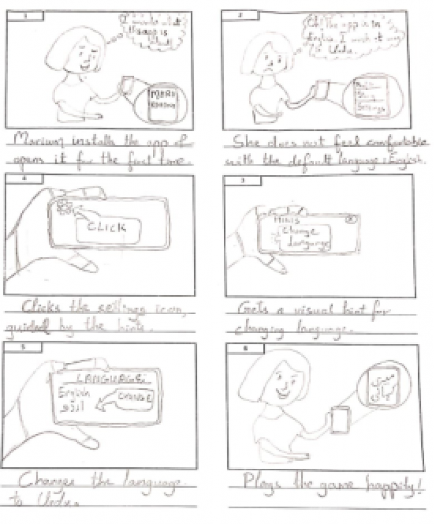
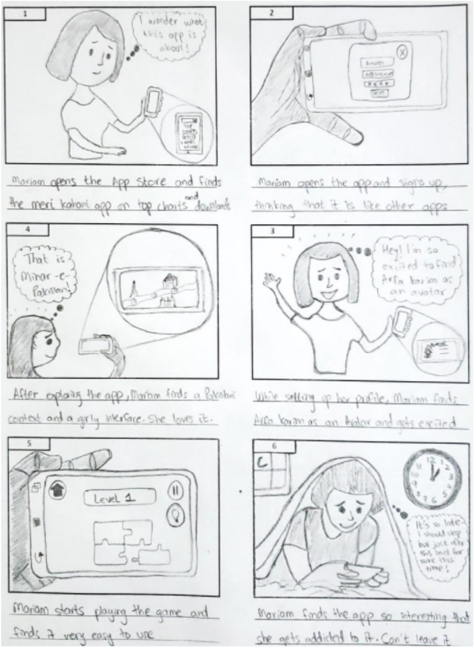
Paper Prototype
We tried to incorporate as many features as possible in our paper-based low-fi prototype. Our map represented on a sheet of paper being slid right and left, along with a female game character that could be moved around on the map using a stick.
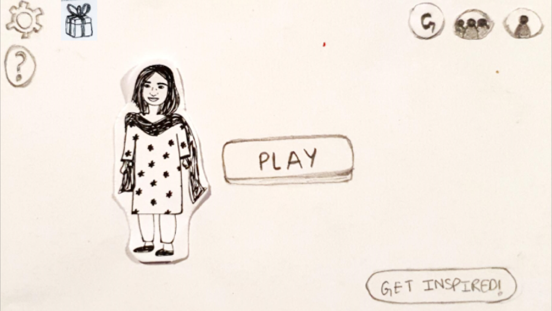
This is the home screen that appears to users after login. It includes a Play button that leads to the Map screen.
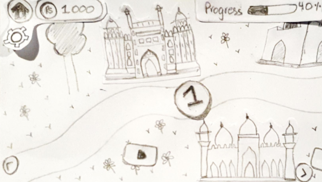
This is the first half of the map displaying monuments like Badshahi Masjid, and Lahore Fort, the first game level and video.
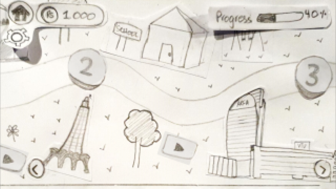
This is the second half of the map screen displaying Minar-e-Pakistan, Arfa Karim Technology Park, game levels and videos.
We tested our paper prototype with our target users and we learned the following:
Users asked for detailed game instructions in order to understand what to do in each game level
Users suggested changing the icon that was being used for the help button as it didn’t match their mental model
Overall the users found the game interesting and fun
If you want to take a detailed look at the paper prototype, here s the link to our video flow.
PART 3
Hi-Fidelity Prototype
Colour Palette
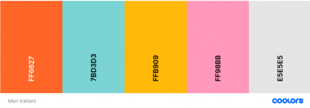
This colour palette was chosen to give the game a femine look and make it
attractive for girls. The colour combination is also a playful one, suiting
game design.
1. Orange color is associated with fun and vibrancy.
2. Being the color of sunshine, yellow puts a smile on the dial. It communicates cheerfulness, friendliness, joy, and energy.
3. Pink is regarded widely as the color of femininity.
4. Teal colour represents the following: broad-minded, and welcoming.
5. Platinum colour is used to balance out the bright colours.
Avatars

Game Assets

Interface
Home Screen
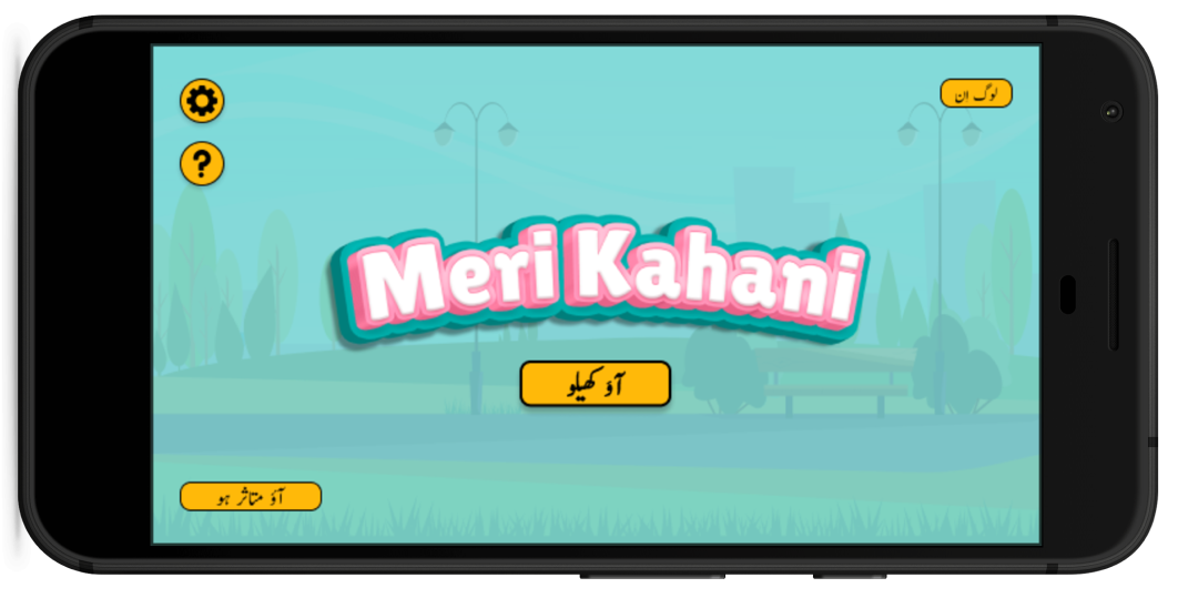
This is the home screen that appears to users before login.
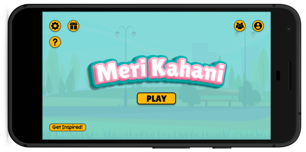
This is the home screen that appears to users after login.
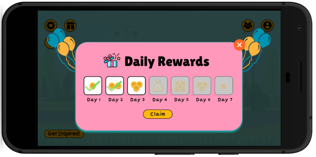
This is the daily rewards pop-up that opens on the home screen.
Profile
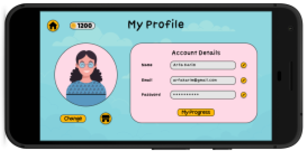
This is the my profile screen that contains details of the user.
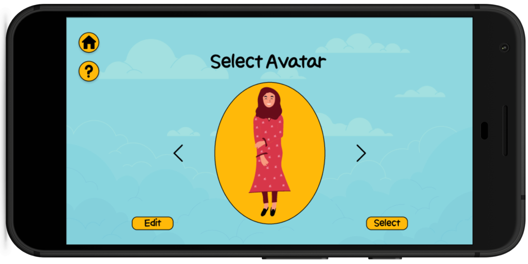
This is the select avatar screen from where users can select their avatars.
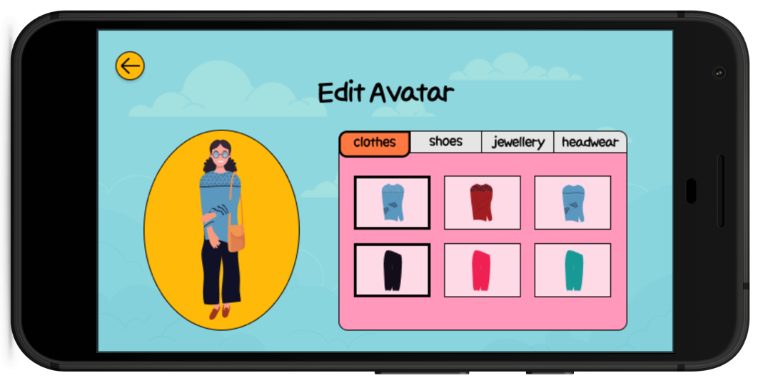
This is the edit avatar screen where users can edit their avatars.
Profile
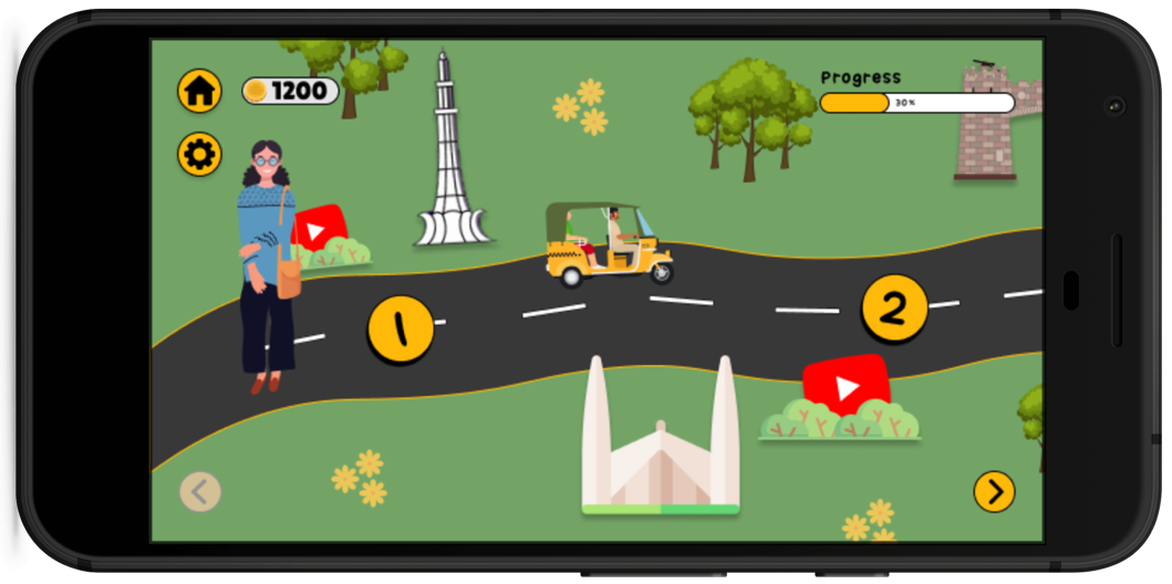
This is the first part of the map. It contains game levels and videos.
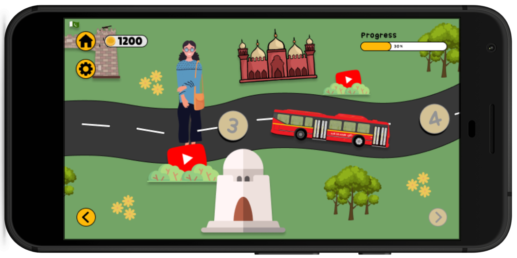
This is the second part of the map. It contains game levels and videos.
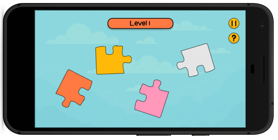
This is one of the game levels that we implemented for puzzle solving.
If you wish to go through the entire prototype, you can find the Figma link here.
PART 4
Evaluation and Usability Testing
Once our hi-fidelity prototype in Figma was made, we conducted remote usability testing with our tafrget user group over zoom. The results are mentioned blow.
The Good
1. Users enjoyed navigating through the map
2. Users loved how creative and appealing the design of the game was
3. Users appreciated the Pakistani themed interface
The Bad
1. Game levels were too easy for some users
2. Game instructions were a bit unclear
3. There was a lack of feedback in the application
Conclusion
For me the highlight of this project was the User Research phase as well as the Design phase. It made me realise the importance of fully undertsanding the problem before diving into the solution. I got to know the importance of interacting with users and making them feel comfortable in order to understand their struggles fully. Furthermore, I learned how to effectively translate findings from the User Research phase into solutions in the Design phase. We implemented our Design on a low-fidelity prototype and tested it with the users before moving to the final Design. This made me understand the importance of humans in the human-centered design approach.
Meet the Team

Mehreen Masood
Senior Student, LUMS

Mujtaba Ahmad Khawaja
Senior Student, LUMS

Shehryar Sharif
Senior Student, LUMS

Omer Iqbal
Senior Student, LUMS

Momin Mehmood Butt
Senior Student, LUMS