PROJECTS
ConnectR
By Fida Hussain

The Challenge.
ConnectR is a web portal aiming to build a platform which connects professors and students for research work collaboration regardless of their institutional boundaries. My responsibility was to know users’ painpoints and solve them using design.
The Process
We followed Human Centered Design process for this project in which we define the problem first, then define and empathize with our users, design prototypes, test them with our users and repeat it.
Our common methodologies during this process includes:
1. User Research (Surveys and Interviews)
2. Ideation
3. Testing
4. Hi-fidelity Prototype
Defining the Problem
There is a huge pool of students also in these fields, but due to socio-economic background and unequal distribution of resources not all the
students have the equal opportunities to collaborate and conduct a research project with professors around the country.
PART 1
User Research
Target Audience:
1. LUMS Students
2. LUMS Faculty
Method:
1. Semi-Structured Interviews
2. Survey
3. Competitor Analysis
Survey
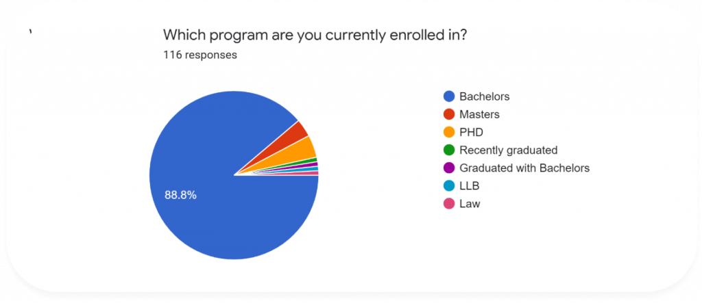
Out of the 116 students that filled out our survey, 55.2% had some prior experience conducting a research. The student breakdown is shown in the figure below, as you can see most of the students were currently enrolled in a bachelor’s program.
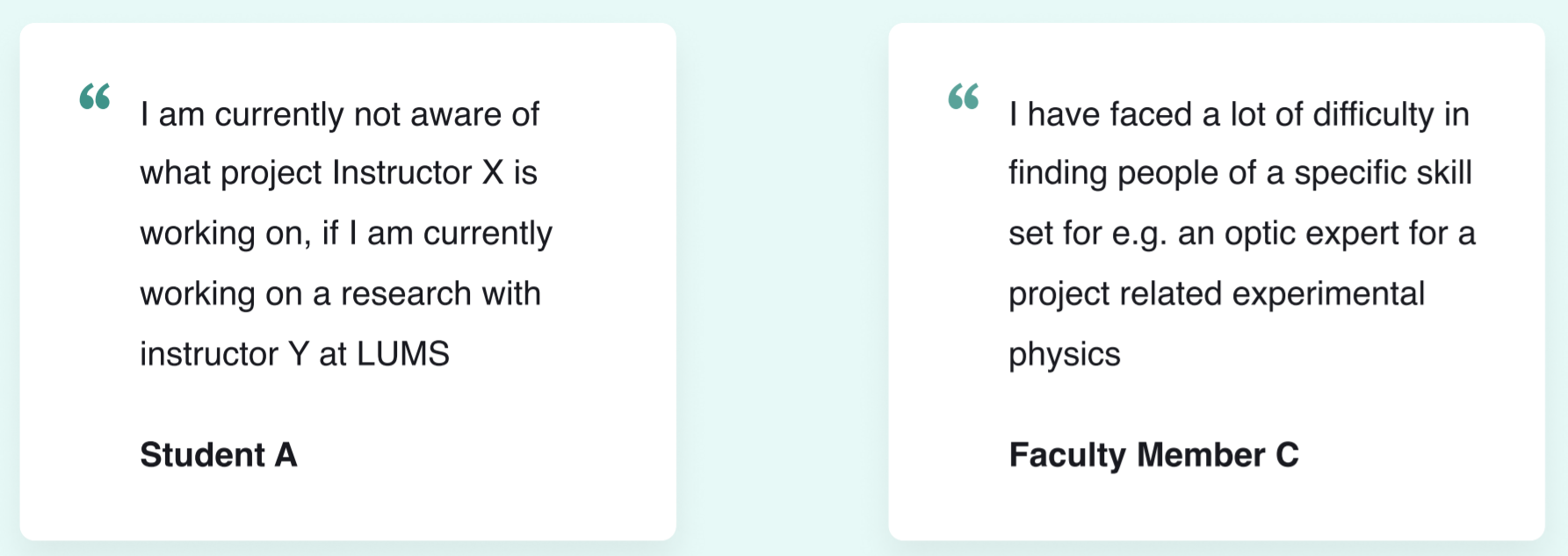
Our findings, as a result of the combination of both quantitative and qualitative analysis based on interviews and survey data, show that problems faced by the researchers can be broadly be divided into the following two themes:
1. Lack of information
2. Lack of resources
Interviews
In our attempt to keep the sample for interviews representative, we interviewed students and instructors from different schools at LUMS.
We found common painpoints through these interviews which are listed below
Faculty’s Needs:

Student’s Needs:

Competitor Analysis
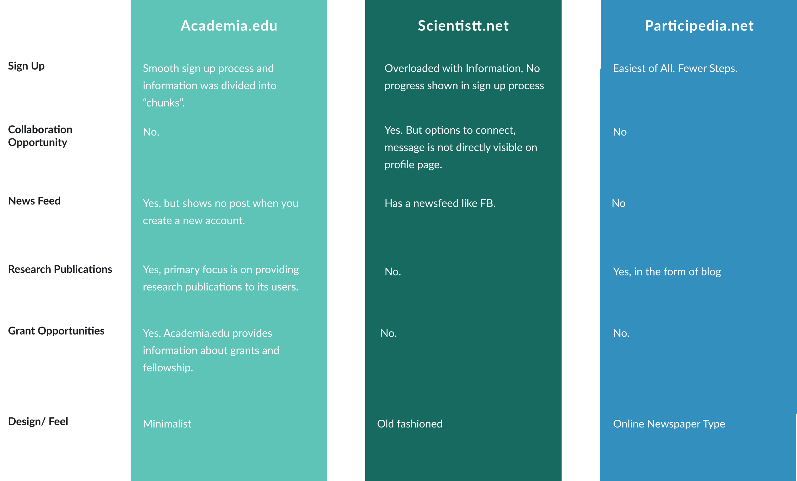
The concept of crowdsourcing is currently being used for several purposes. Live collaboration, forum discussion, and easy access are amongst the general features that these existing platforms provide.
In the following section, the features of some of the most popular existing products are highlighted.
PART 2
Ideation
Brainstorming
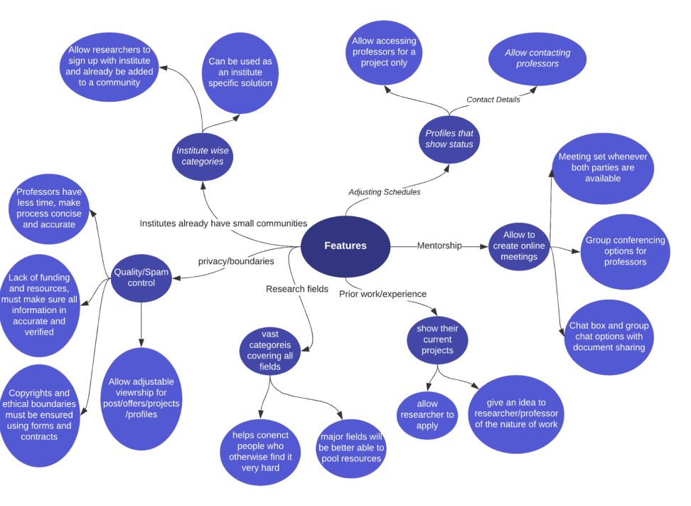
When discussing most of our ideas we found that most of them were very interlinked together and therefore the whole chain of commands must be coherent for them to function properly. Therefore, in our brainstorming session we jotted down the important features as follows in a spider concept map.
Sketching
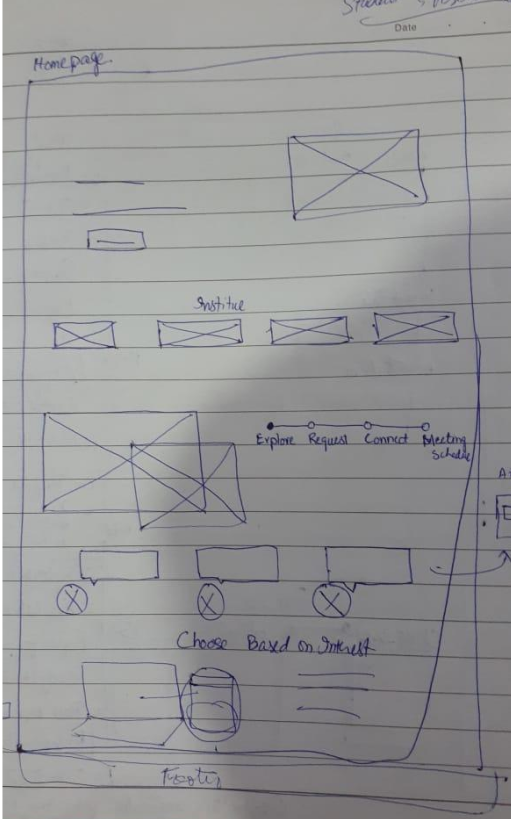
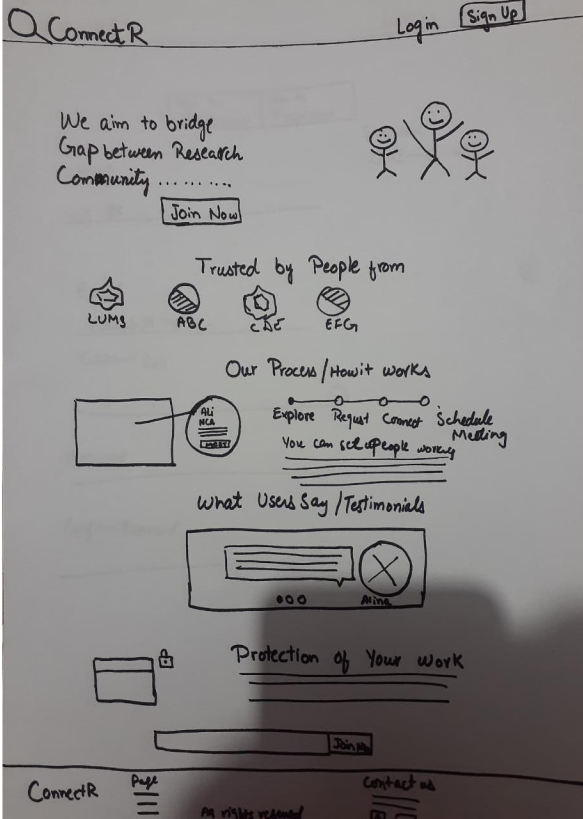
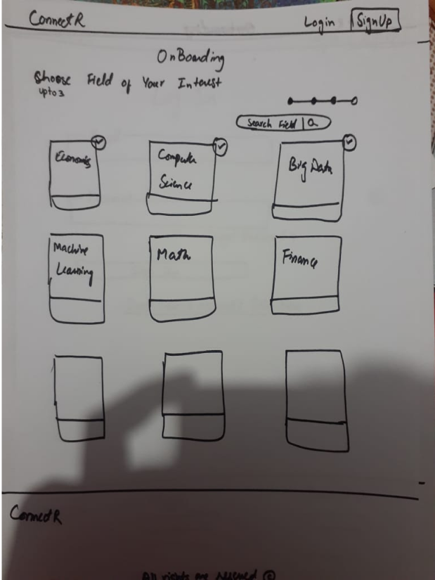
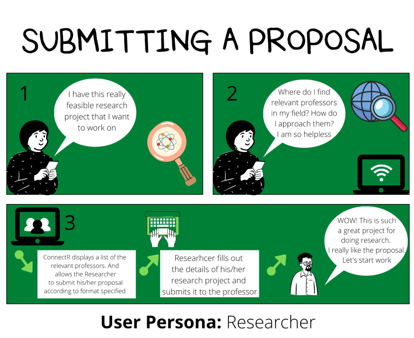
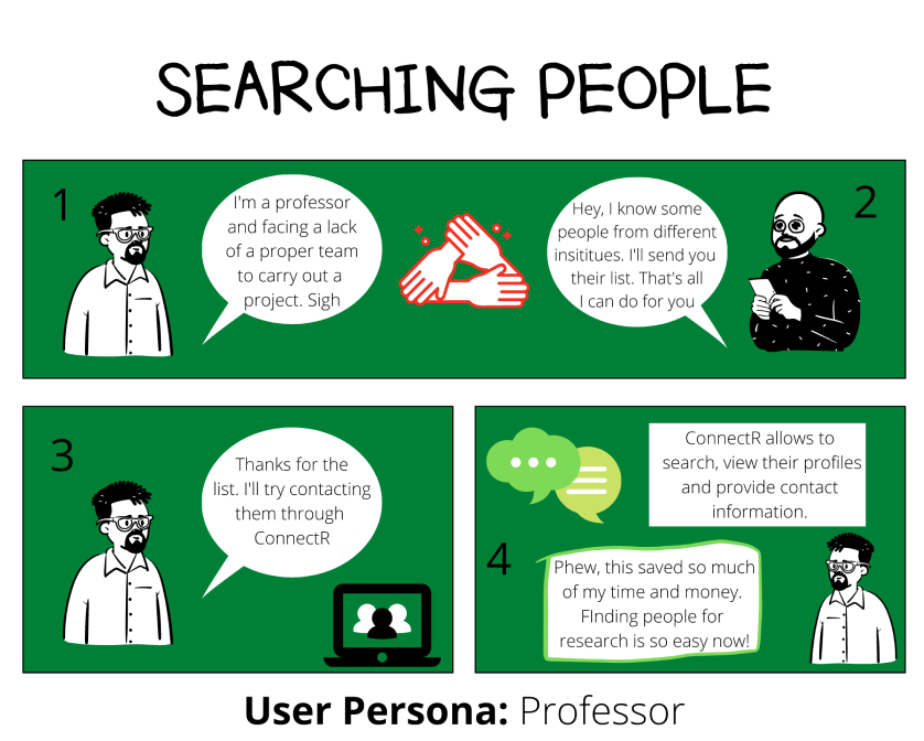
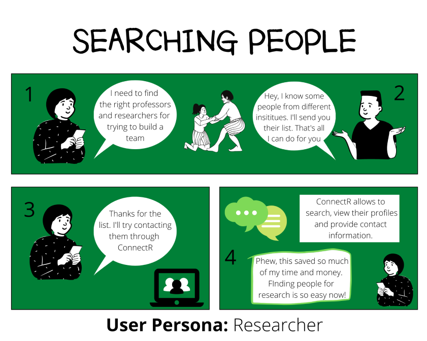
Scenarios
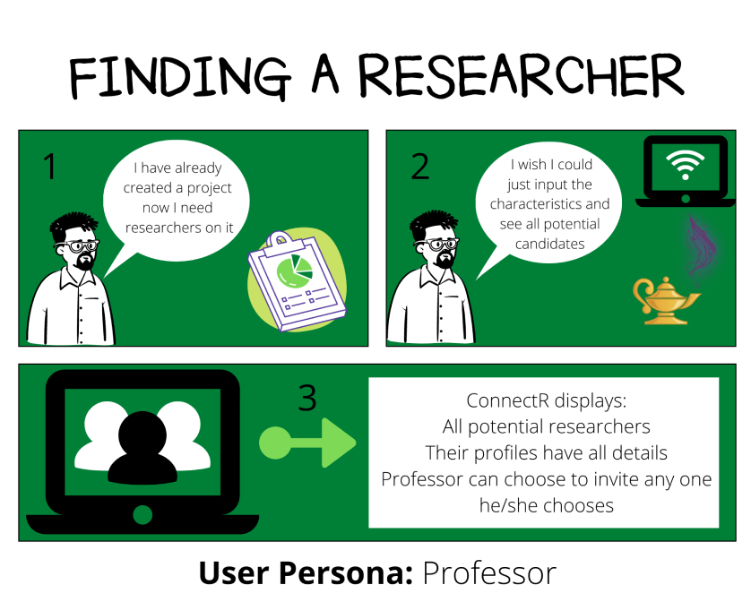
Paper Prototype
We used paper prototyping was as an attempt to understand our final design better by getting feedback from our users.
Results:
1. Lack of guidance
”There should be a guidance or tutorial that helps the user to understand the platform once they sign up. Even though the sign up is a standard
procedure, I would still be more comfortable if there was a small tutorial. [Researcher A]”
2. User verification
”How will I distinguish between a real and spam user? I don’t know it just feels to risky to share your idea with someone, without knowing there is
a guarantee of them not being real. [Professor A]”
3. User suggestions
”The limitation in the chat to share documents should be large enough that it allows to exchange vital information to the research instantly.
[Researcher B]”
PART 3
Hi-Fidelity Prototype
Color Scheme
1. Bluish Black:
We chose to go for the Dark UI in initial stages of ConnectR because of
following reasons:
a. For our first user group who were the professors of LUMS, we used a Dark UI as it would help us highlight only the important information, increasing the visibility of content that matters to the user.
b. Our second User Group was aged between 20-30. Based on research, people of this age group are generally attracted towards dark interfaces.
2. Green:
We chose the subtle tone of green as our primary color for this platform
because green symbolizes growth, harmony, and safety.
As ConnectR aims to provide opportunities to students to excel in their
field by creating a research community while preserving the original
authorship of people’s work, we believe green truly depicts our
intentions.
Moreover, ConnectR focuses on connecting researchers and professors
of PAKISTAN. So, green would be an ideal choice because it is a
representative color for the country worldwide.
We have used material.io as the design system for this project.
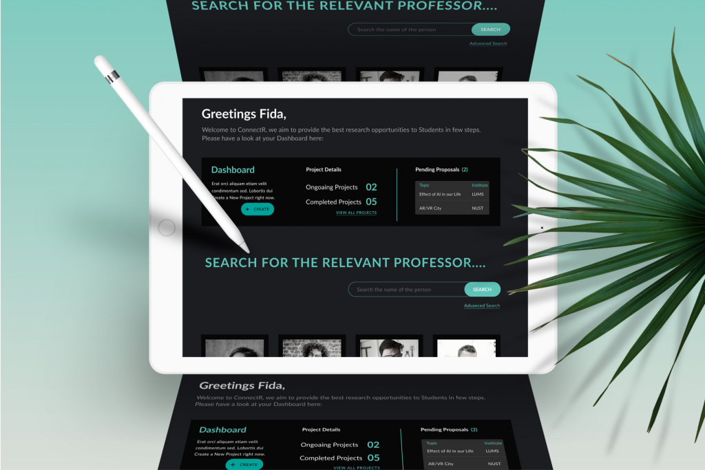
Interface


PART 4
Evaluation and Usability Testing
We conducted Usbaility Testing Interviews with our users on Zoom. Broadly what we observed from the users can be categorized as follows:
The Good
1. Simplistic and highly functional home page layout
2. Professional communication only
3. Dark theme, helps concentrate more
4. Only professor to researcher communication and vice versa, avoids spam buildup
The Bad
1. Confusion
2. Lack of Guidance/Feedback
3. Restricted Communication
Conclusion
In order to better evaluate the user, an in-person usability testing of a complete prototype is probably the ideal way to test an app. Therefore, the
revisions that will be carried out after incorporating the findings into the design, the future evaluation must only be conducted using a complete
prototype and preferably in a much more controlled environment rather than conducting it remotely over zoom.
It was a great project helped us learn about UX principles and practices like storybording, wireframes, user research, low and hi fidelity deisgns. It helps us to see the products from users’ perspective and how we can make their lives better with UX
Meet the Team

Fida Hussain
Senior Student, LUMS

Faisal Aslam
Senior Student, LUMS
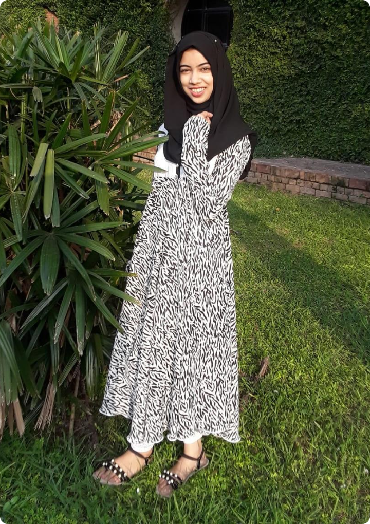
Sabahat Kashif
Senior Student, LUMS

Shahzil Rizwan
Senior Student, LUMS